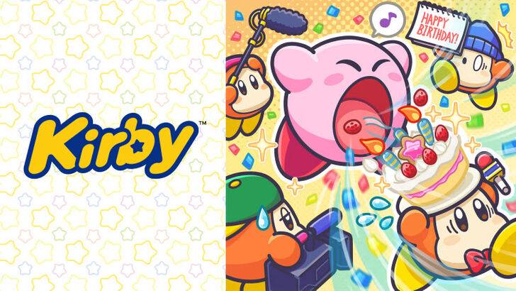
by Gabriella Feb 25,2025
Exploring the Evolution of Kirby's Image: From "Angry Kirby" to Global Consistency
This article delves into the fascinating story behind Kirby's differing appearances in the US and Japan, shedding light on Nintendo's localization strategies and their evolution over time. Former Nintendo employees offer insights into the decisions behind the iconic pink puffball's image transformation.
The "Angry Kirby" Phenomenon: A Western Marketing Strategy
Early Western marketing portrayed Kirby with a more determined, even "angry," expression on game covers and promotional materials. This was a deliberate attempt to broaden the character's appeal, particularly among male tween and teen audiences. Leslie Swan, former Nintendo Localization Director, clarified that the intent wasn't to make Kirby angry, but to convey determination, acknowledging the differing preferences between Japanese and Western markets. Shinya Kumazaki, director of Kirby: Triple Deluxe, highlighted the contrast: while cute Kirby resonated strongly in Japan, a tougher, battling Kirby proved more appealing in the US. However, he noted that this approach varied depending on the game, citing Kirby Super Star Ultra as an example with consistent artwork across regions.
Marketing Kirby as "Super Tuff Pink Puff": Beyond Cuteness
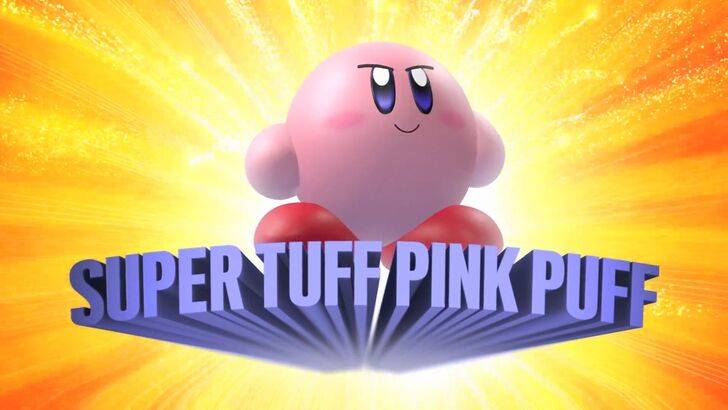
Nintendo's marketing strategy aimed to move beyond the "kiddie" image often associated with the company and its games. Krysta Yang, former Nintendo of America Public Relations Manager, shared that the label "kiddie" was detrimental to sales. The "Super Tuff Pink Puff" tagline for Kirby Super Star Ultra exemplifies this shift towards emphasizing Kirby's combat abilities and presenting him as a more action-oriented character. While recent years have seen a focus on gameplay and abilities over personality, the perception of Kirby as "cute versus tough" remains prevalent.
A History of Localization Differences: From Monochrome to Marketing Adjustments
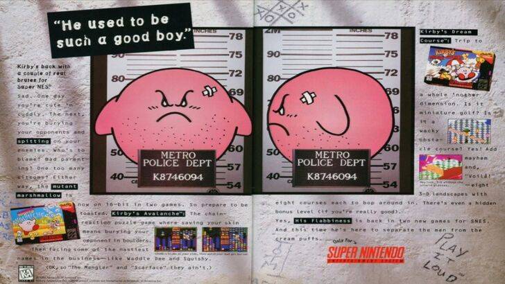
The differences in Kirby's image extend beyond facial expressions. The original Kirby's Dreamland for Game Boy featured a ghostly-white Kirby in its US release due to the system's monochrome display, differing from the pink hue of the Japanese version. This early discrepancy, coupled with the belief that a "puffy pink character" wouldn't appeal to the target Western demographic, influenced subsequent decisions regarding Kirby's image. The "Play It Loud" campaign's mugshot-style advertisement further exemplifies the early attempts to reposition Kirby.
A More Global Approach: Consistency and Brand Identity
Both Swan and Yang agree that Nintendo's approach has become increasingly globalized. Closer collaboration between Nintendo of America and its Japanese counterpart has led to more consistent marketing and localization strategies, reducing regional variations in artwork and avoiding past marketing missteps. While this consistency benefits brand recognition, it can also lead to a perceived lack of regional nuance, potentially resulting in less impactful marketing. The shift also reflects the growing global awareness of Japanese culture and the changing tastes of Western audiences.
The evolution of Kirby's image highlights the complexities of global marketing and the ongoing balance between appealing to diverse audiences while maintaining a consistent brand identity.
How to Feed Villagers in Necesse
Bitlife: How to Complete the Renaissance Challenge
Bahiti Hero Guide: Mastering the Epic Marksman in Whiteout Survival
The Best Nintendo Switch Games That Don\'t Require An Internet Connection
Ragnarok V: Returns Beginner's Guide - Classes, Controls, Quests, Gameplay Explained
"Ōkami 2: Capcom, Kamiya, and Machine Head Discuss Sequel in Exclusive Interview"
Best Bullseye Decks in Marvel Snap
One of the most famous CoD players thinks the series is in the worst state now
Nioh 3 Unveiled at Sony's June 2025 State of Play
Jul 08,2025
"Frostpunk 1886 Remake Set for 2027, Developer to Keep Updating Frostpunk 2"
Jul 08,2025
"Among Us 3D Release Date Announced, Distinct from VR Version"
Jul 08,2025
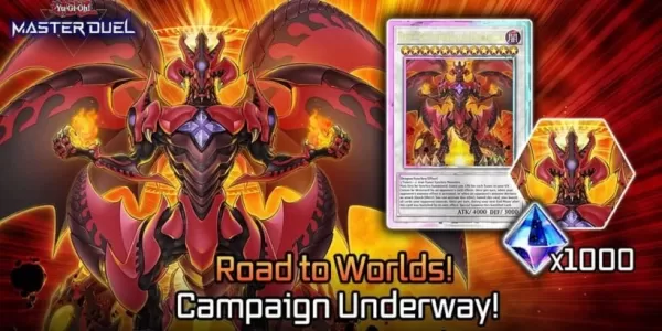
"Yu-Gi-Oh! Master Duel and Duel Links: Road to Worlds and WCS Qualifiers Return"
Jul 08,2025
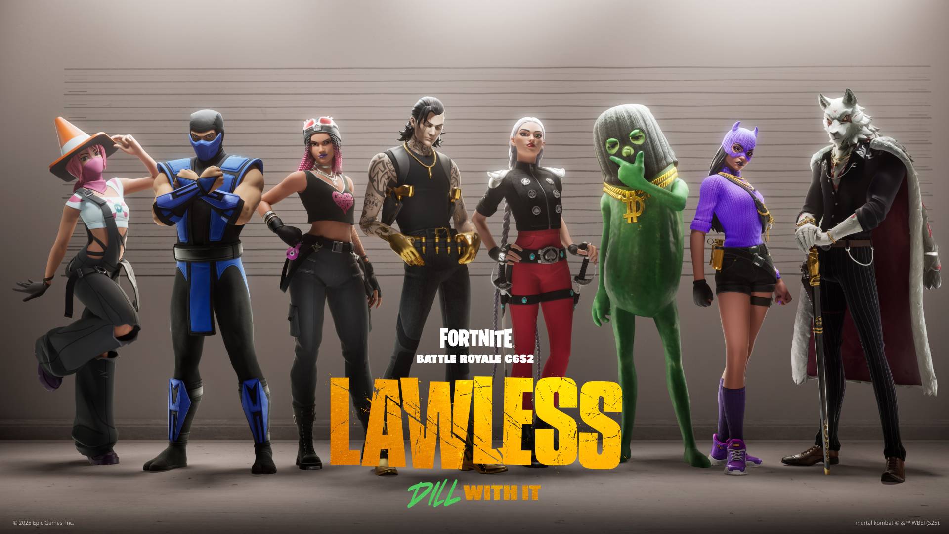
How To Purchase a Deluxe Outlaw Character Service in Fortnite Chapter 6
Jul 07,2025
 Category